Introduction: Why Dashboard Metrics Matter
Most crypto traders judge their performance emotionally. If the last few trades were green, confidence goes up. If the last few trades were red, doubt and hesitation creep in. The problem is that feelings rarely match reality, especially in a market that runs 24/7, moves fast, and punishes small mistakes with leverage, liquidation risk, and fees.
If you scalp Bitcoin on Binance Futures or take multiple short-term ETH trades on Bybit in a single day, your brain will naturally remember the wins more vividly than the losses. You might think you are improving, even when the data shows the opposite. Or you may feel like you are doing badly, when in reality you are quietly building a consistent equity curve.
This is why a trading dashboard matters. It replaces guesswork with truth.
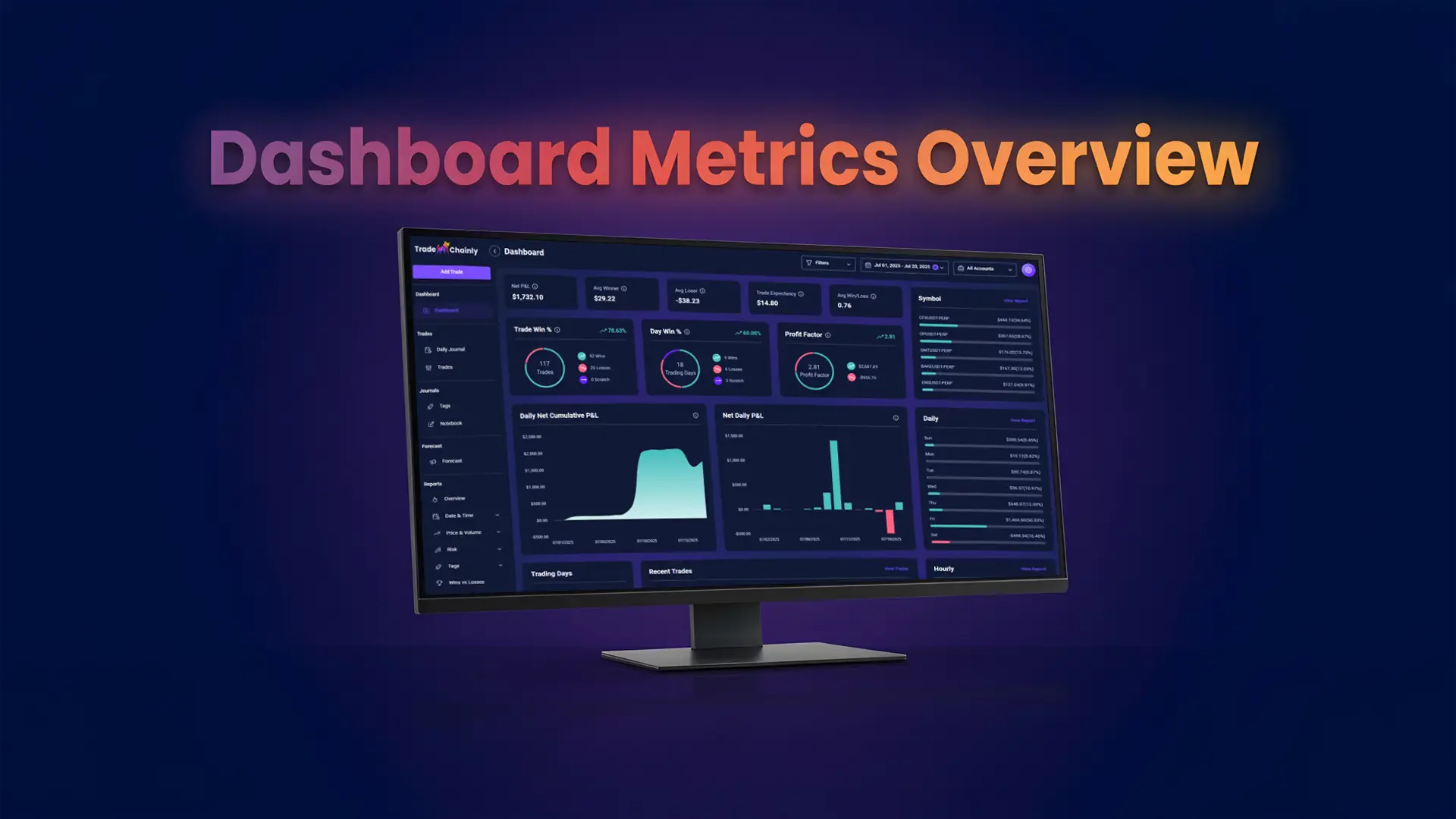
The TradeChainly dashboard gives you a high-level snapshot of your trading performance across all connected crypto exchanges. It shows your Net P&L, win rates, risk-reward profile, and key performance graphs so you can understand what is really happening in your trading. You do not need spreadsheets. You do not need to manually calculate things. TradeChainly pulls in your trades automatically, processes the data, and turns it into clear insights you can use every day.
When you log into TradeChainly, the dashboard becomes your performance home base. It gives you clarity at a glance. Are you profitable overall? Are your winners strong enough to pay for your losers? Are fees eating into your results? Do you trade better at certain times of day? Do you perform better on certain symbols like BTCUSDT or SOLUSDT?
These are questions serious crypto day traders must be able to answer.
This guide will walk you through every dashboard metric inside TradeChainly, explain what it means, and show you how to use it to make smarter trading decisions. The goal is simple. You should be able to open your dashboard, read it clearly, and instantly understand the truth about your trading performance.
Because the traders who improve the fastest are the ones who track the right numbers consistently.
Overview of the TradeChainly Dashboard
Before we break down each metric in detail, it helps to understand what the TradeChainly dashboard actually represents. Think of it as the central control panel for your trading performance. The dashboard is the first page you see when you log into TradeChainly, and it gives you a complete overview of your trading results across all connected exchanges, accounts, and trading sessions.
If you trade on Binance, Bybit, Coinbase, OKX, or multiple exchanges at the same time, your trades often end up scattered across different platforms. TradeChainly solves that by automatically syncing your trade history into one clean dashboard. Every filled order flows into your account, gets grouped into trades, and is then processed into meaningful performance metrics.
The dashboard is not meant to overwhelm you with information. Instead, it focuses on the key data points that matter for crypto day traders and scalpers. These are the metrics that reveal whether your strategy is truly profitable, whether your risk is under control, and whether your results are improving over time.
You can think of the dashboard as a high-level helicopter view of your trading. It does not replace deeper analysis pages like Reports, Trade Details, or Tag analytics. Instead, it shows you the big picture first. From there, you can drill down into the details when something stands out.
Another important thing to understand is that the dashboard is always updating. When TradeChainly syncs your trades automatically, the dashboard refreshes to reflect your latest performance. This means you always have real-time insight into how your trading month or week is going, without needing to calculate anything manually.
So when you open the TradeChainly dashboard, you are not just looking at numbers. You are looking at an objective story about how you trade, how disciplined you are, and how your decisions play out in the real market. Once you know how to read this story, you can start improving it.
Core Profitability Metrics
The first group of metrics you will see on the TradeChainly dashboard are focused on one simple question: are you making money or losing money over time? These core profitability metrics give you a clear financial picture of how your trading strategy is performing in real markets. If you only looked at one part of the dashboard each day, this would probably be it.
Let’s break them down one by one.
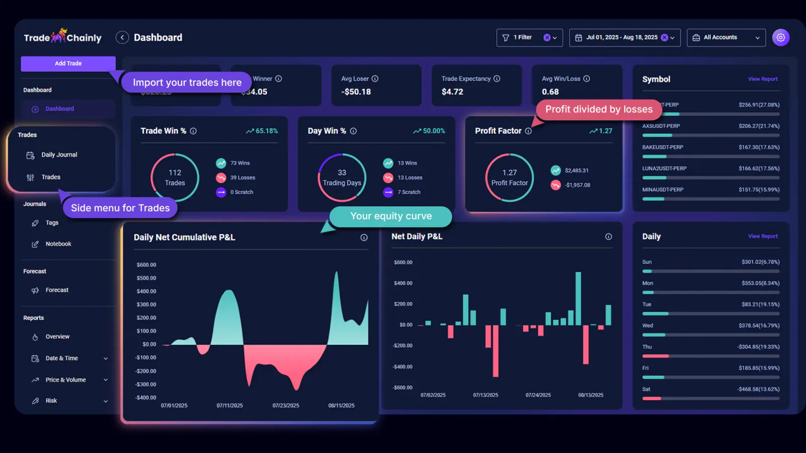
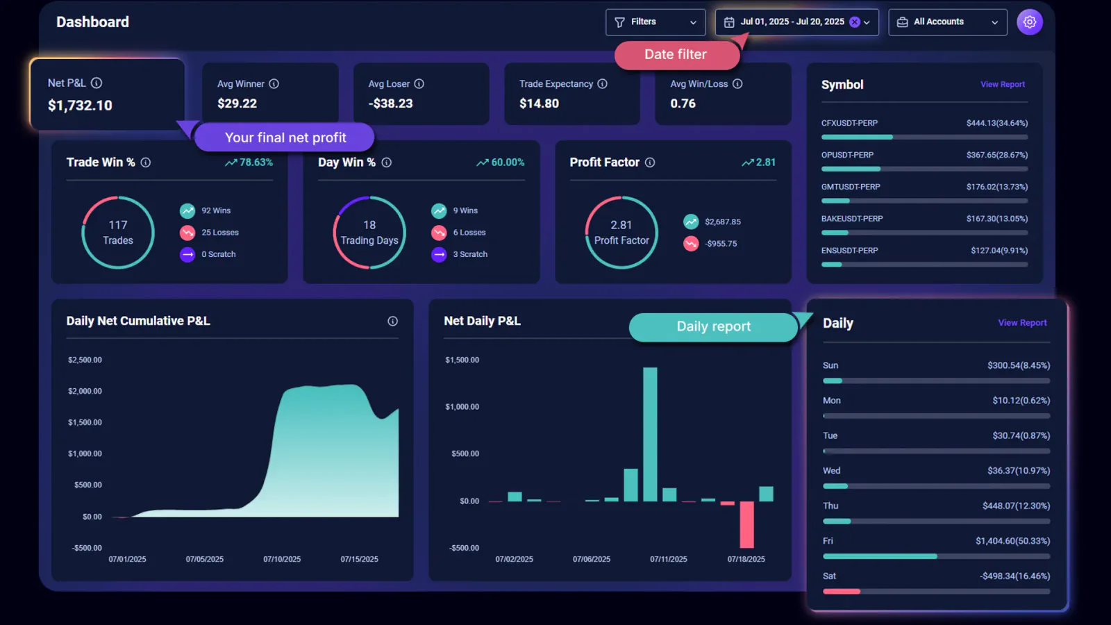
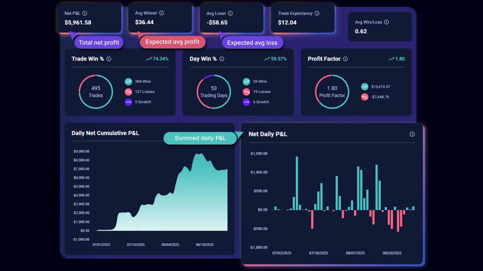
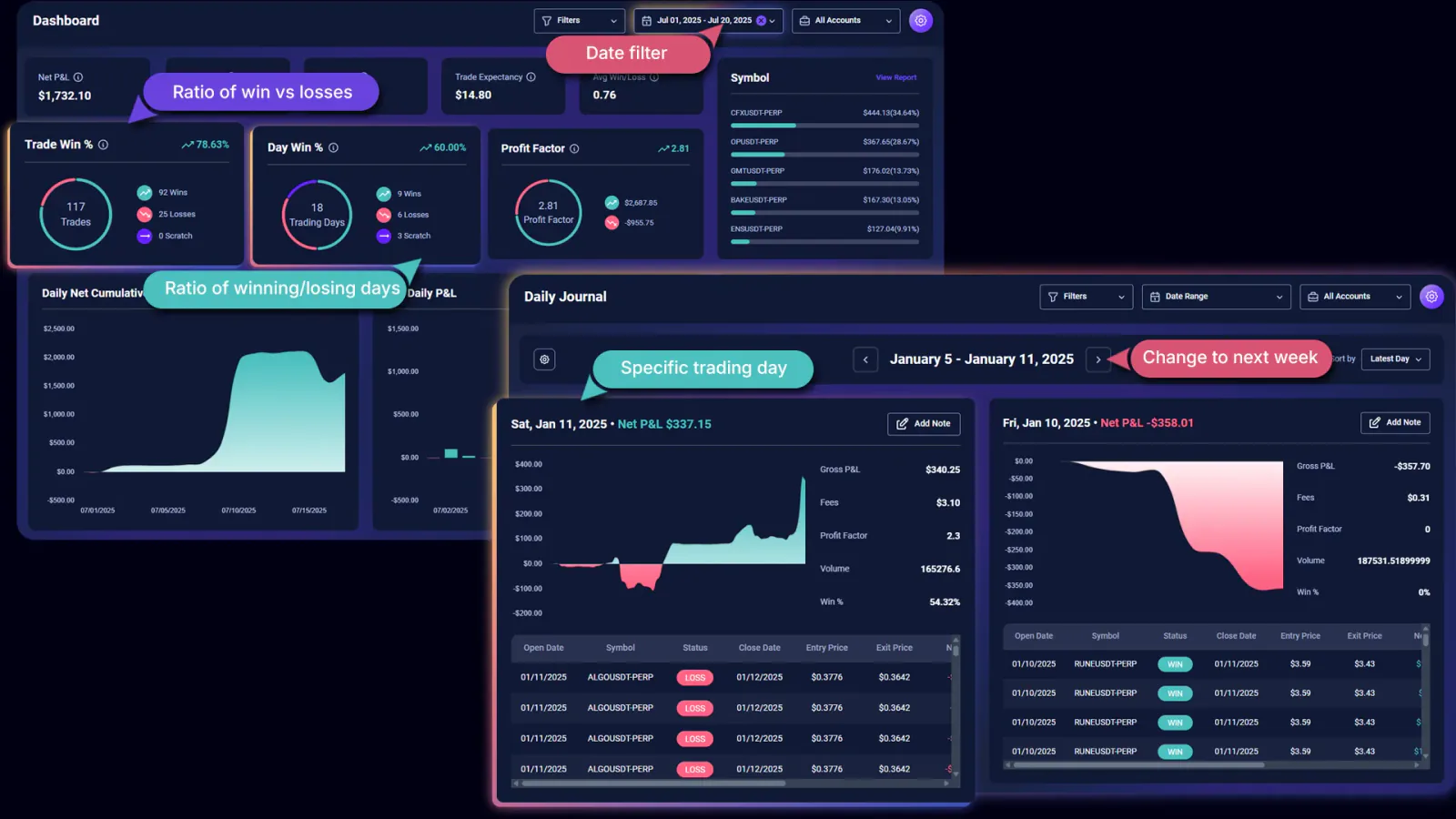
Net P&L
Net P&L shows the total realized profit or loss from all of your trades after accounting for trading fees and other costs. This is the most honest way to measure performance because crypto fees and funding payments can significantly change your real results, especially if you scalp frequently or trade with leverage on exchanges like Binance Futures, Bybit, or OKX.
Gross profit might look impressive, but net profit is what actually hits your account.
For example, if you made $2,000 in winning trades but paid $400 in fees and funding, your Net P&L is $1,600. TradeChainly calculates this automatically across all connected exchanges and accounts, so you always see your true bottom line rather than a polished version of it.
Traders often underestimate how much fees impact scalping strategies. If you are entering and exiting multiple positions per session, Net P&L will quickly reveal whether your edge is strong enough to overcome the friction of trading costs. If your Net P&L curve is flat or negative while your Gross P&L is positive, that usually means fees are quietly eating into your results.
Average Winner and Average Loser
These two metrics show the average size of your winning trades and the average size of your losing trades. They are important because they reflect your risk discipline more clearly than you might expect.
If your Average Winner is consistently smaller than your Average Loser, that often means you are cutting winners too early and letting losers run too long. This is one of the most common tendencies among crypto day traders, especially during periods of volatility when emotions run high.
On the other hand, if your Average Winner is meaningfully larger than your Average Loser, you often do not need a very high win rate to be profitable. This is how many professional traders approach the market. They focus on strong risk-to-reward setups and accept that not every trade will work out. TradeChainly lets you see whether your current trading style lines up with that principle.
A simple example helps. Imagine you scalp BTCUSDT and ETHUSDT on Bybit. If your Average Winner is $50 and your Average Loser is $25, your winners are twice as big as your losers. Even with a win rate near 40 percent, you might still be profitable. Without these metrics, you might never realize that your edge comes from risk-reward rather than accuracy.
Trade Expectancy
Trade Expectancy is one of the most important but misunderstood trading metrics. It represents the average amount you can expect to make or lose per trade based on your past results. In other words, if you placed the same type of trade 1,000 more times, this metric tells you what the average outcome would likely be.
Trade Expectancy combines both your win rate and your risk-reward profile into a single number. That makes it a powerful tool for day traders who want to think like professionals rather than gamblers.
If your Trade Expectancy is positive, it means your strategy has a positive edge. Over a large number of trades, you are expected to make money. If it is negative, your strategy is working against you, even if you occasionally have big winning streaks.
Crypto markets are fast, emotional, and highly leveraged. That can create the illusion of success when a few lucky trades go your way. Trade Expectancy cuts through that noise. When you look at this metric on your TradeChainly dashboard, you are asking a serious question: is my approach mathematically sound, or am I relying on luck?
This is the same way professional traders think about their systems. TradeChainly simply makes it accessible to everyday crypto traders.
Risk-Reward and Consistency Metrics
Profitability is only one part of the story. Two traders can have the same Net P&L, but one may be trading with controlled risk while the other is gambling and eventually heading toward a blow-up. That is why the TradeChainly dashboard also focuses on metrics that reveal the quality and stability of your trading performance.
These risk-reward and consistency metrics help you understand whether your strategy is sustainable in the long run, not just temporarily profitable.
Average Win/Loss Ratio
The Average Win/Loss Ratio compares the average size of your winning trades to the average size of your losing trades. It shows how much you typically make when you win versus how much you typically lose when a trade goes against you.
If your Average Win/Loss Ratio is 2.0, it means your winners are twice as large as your losers on average. If it is 0.8, your losing trades are larger than your winning trades.
This metric is important because it reflects your discipline with exits and stop losses. Many crypto traders make the mistake of letting losers run while cutting winners too early. This often leads to a weak Average Win/Loss Ratio, which forces the trader to rely on a very high win rate just to stay profitable.
On the other hand, traders who maintain a healthy ratio do not need to win very often. They can be profitable with a win rate near 40 percent or even lower, because their winners make up for their losses. TradeChainly shows you this ratio clearly so you can see which side of that equation you are on.
If you trade leveraged futures on Binance, OKX, or Bybit, this metric becomes even more critical. Leverage amplifies both gains and losses, so your risk-reward discipline must stay tight. A poor Average Win/Loss Ratio combined with high leverage is usually a warning sign that things may eventually crack.
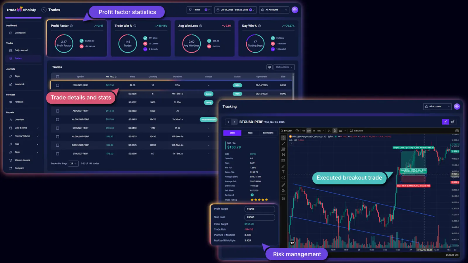
Profit Factor
Profit Factor is another key metric on the TradeChainly dashboard. It represents the ratio of your total profits to your total losses. A Profit Factor above 1.0 means your trading system is profitable overall. A value below 1.0 means your losses outweigh your gains.
For example, if your total winning trades equal $10,000 and your losing trades equal $5,000, your Profit Factor would be 2.0. That means you make two dollars for every one dollar you lose.
Profit Factor is useful because it provides a more complete view than win rate alone. A trader could have a 70 percent win rate but still have a Profit Factor below 1.0 if their losses are much larger than their wins. Another trader could have only a 40 percent win rate but still maintain a strong Profit Factor because they control risk effectively and let winners run.
Crypto traders sometimes see their Profit Factor swing around during periods of high volatility. That is normal. The key is the long-term trend. If your Profit Factor stabilizes above 1.0 over a large sample of trades, it usually indicates you are trading with an actual edge rather than luck or randomness.
Trade Win Percentage vs Day Win Percentage
TradeChainly also separates your Trade Win Percentage from your Day Win Percentage. These two metrics sound similar, but they tell very different stories about your behavior in the market.
Trade Win Percentage represents the percentage of your individual trades that close in profit. This is the classic definition of win rate. It reflects how often your trades work out.
Day Win Percentage, on the other hand, looks at your trading days as a whole. If you place multiple trades in one session, TradeChainly will look at the final net result of that day and classify it as a winning day, losing day, or breakeven day. Day Win Percentage then shows how often you finish the day in profit.
Many crypto traders find that their Trade Win Percentage is higher than their Day Win Percentage. This usually means one of two things is happening. Either losers are wiping out multiple winning trades, or emotions are leading to revenge trading after a loss.
If you see that you win most trades but still have many losing days, it is a sign that risk control needs work. On the other hand, if both percentages are healthy, you are probably managing drawdowns well and finishing sessions with discipline.
This is where TradeChainly becomes more than just a data tool. It becomes a mirror for your trading behavior. Seeing both numbers side by side helps you understand whether you are thinking in terms of single trades or overall daily performance. Serious traders tend to focus on the day as the real unit of measurement.
Time-Based Performance Insights
So far, we have focused on metrics that summarize your overall trading performance. But there is another layer of insight that matters just as much. It is not only about how much you make or lose. It is also about when those results happen.
Time-based analytics help you understand patterns in your trading behavior across different days, sessions, and market conditions. This is especially important in crypto, where the market never closes and price action changes dramatically depending on the time of day and the region that is most active.
The TradeChainly dashboard includes several powerful visual tools that reveal these timing patterns clearly.
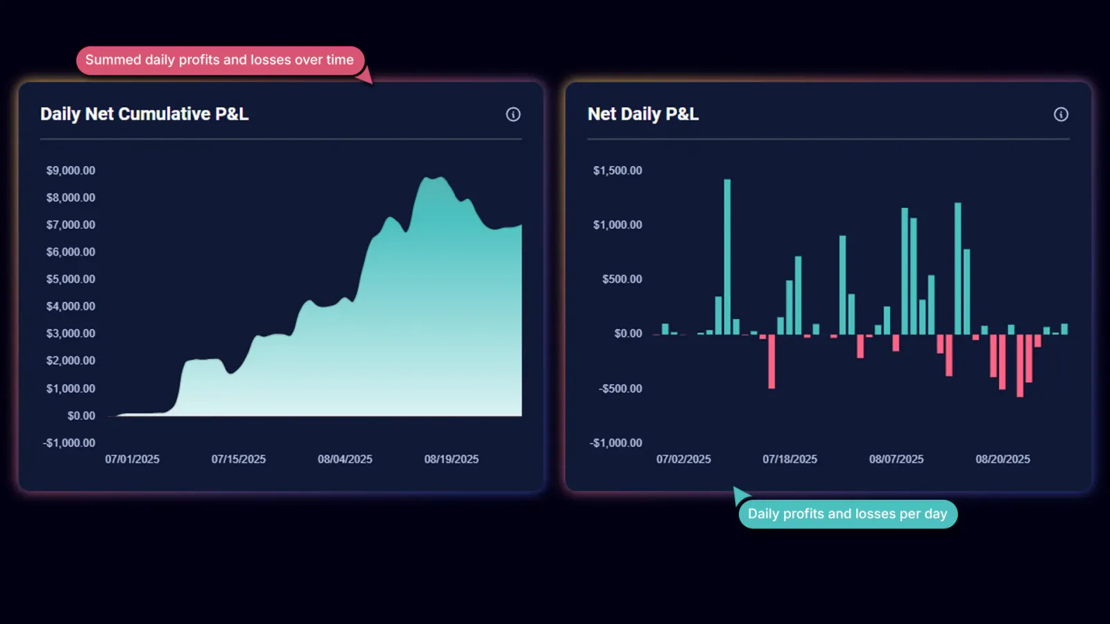
Daily Net Cumulative P&L Chart
The Daily Net Cumulative P&L Chart shows how your total trading profit or loss builds up over time, day by day. Think of it as your equity curve. Each point on the chart represents your cumulative Net P&L up to that day.
If the line trends upward smoothly, that usually means your trading is consistent and stable. If the line is volatile, spiky, or trending downward, it may indicate overtrading, inconsistent discipline, or a strategy that is not as reliable as you think.
Many crypto traders experience periods where they grind up slowly, then wipe out multiple days of gains in one bad session. The cumulative P&L chart makes this pattern impossible to ignore. It forces you to ask why those big downswings happen and what you can do to prevent them.
Net Daily P&L Chart
The Net Daily P&L Chart zooms in to show your net result for each individual day. Instead of looking at your overall progress, you see one bar per trading day representing how much you made or lost.
This chart is especially useful for spotting streaks and emotional trading cycles. For example, you might notice that a big losing day is often followed by another losing day. That can be a sign of tilt, revenge trading, or chasing the market after a mistake.
On the other hand, if your losing days are controlled and relatively small while your winning days are larger, that is usually a sign of strong discipline and solid risk management. TradeChainly helps you see this clearly without doing any manual calculations.
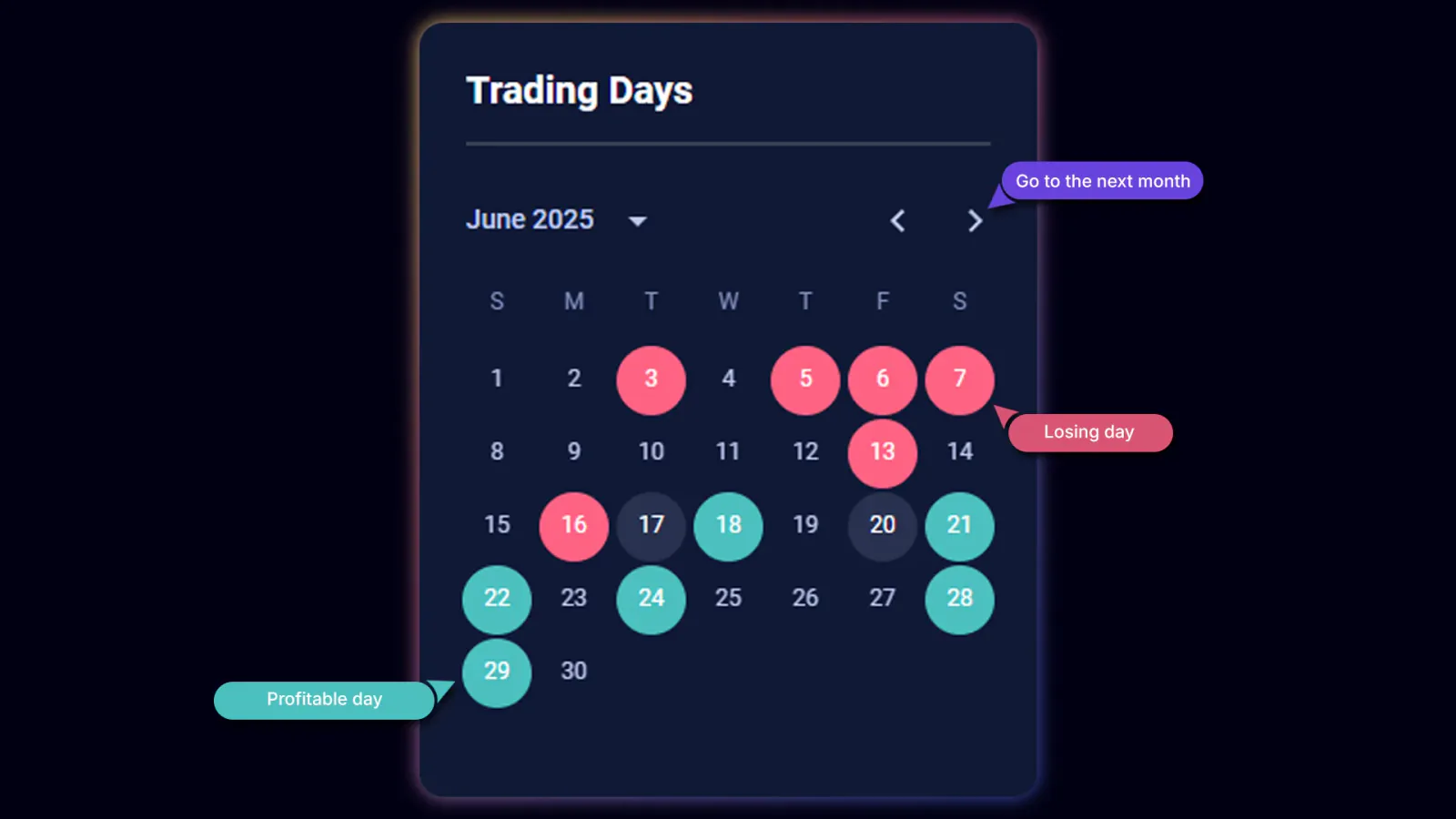
Trading Days Calendar
The Trading Days Calendar gives you a visual month-by-month view of your results. Profitable days appear in green, losing days in red. Neutral or breakeven days will stand out as well.
This calendar is powerful because it adds context to your habits. You may notice that you trade better on weekdays and worse on weekends. Or that you struggle during certain volatile periods, such as major CPI releases or Bitcoin funding flips. You may even see that you trade poorly when you increase your frequency or change symbols.
Crypto is a 24/7 market, but you are still human. Your energy, focus, and emotional state will change throughout the week. The Trading Days Calendar gives you a way to spot those seasonal and behavioral patterns over time.
When you combine all three time-based visuals, you start to build a deeper relationship with your trading data. You are no longer just counting wins and losses. You are understanding how your performance evolves across days, weeks, and broader market conditions.
This is one of the key advantages of using TradeChainly instead of spreadsheets or manual journaling. The platform does the heavy lifting for you, so you can focus on interpretation and better decision-making in live markets.
Snapshot Reports on the Dashboard
Beyond the main metrics and charts, the TradeChainly dashboard also includes several snapshot-style reports. These give you quick insights into where your performance is coming from without forcing you to dig deep into filters or full reports. Think of them as fast pattern detectors that help you see what is working and what is not.
These snapshots are especially useful for active crypto day traders because your trading volume is often high, your environments change quickly, and your edge may depend on small but repeatable behaviors.
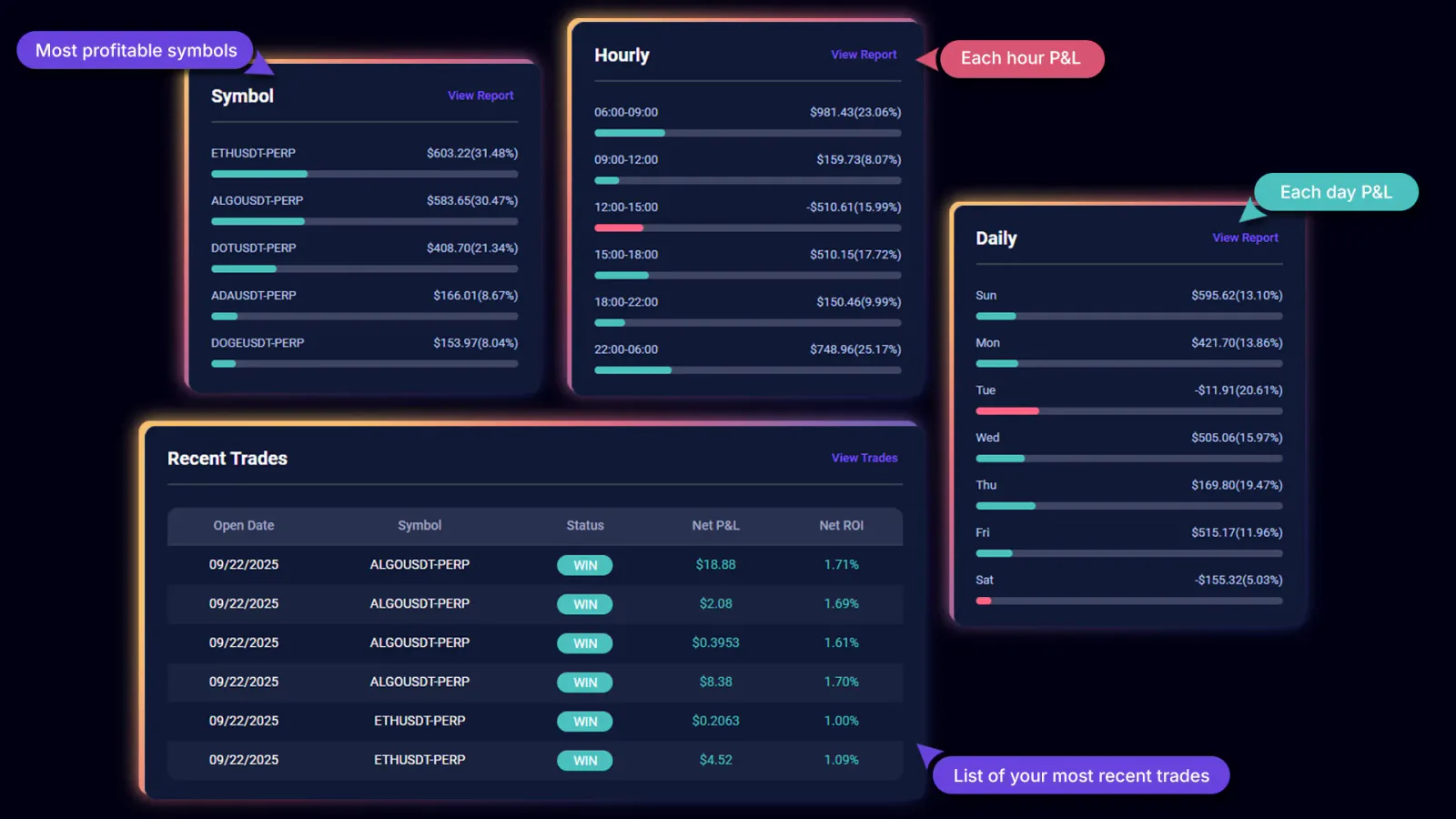
Symbol Report Snapshot
The Symbol Report Snapshot highlights your top-performing symbols. If you trade BTCUSDT, ETHUSDT, SOLUSDT, XRPUSDT, or any other pairs across spot or futures markets, this snapshot shows which ones are driving your results.
Many traders assume they perform well across all markets. But when TradeChainly breaks it down, they often discover that most of their profits come from only one or two pairs. For example, you may find that you are very profitable trading ETH but consistently lose when trading altcoins with thinner liquidity.
Once you see this pattern, you can realign your focus toward the symbols where you actually have an edge.
Daily Report Snapshot
The Daily Report Snapshot shows how your trading performance is distributed across the days of the week. This helps you see if certain days tend to be more profitable or riskier for your style of trading.
For example, you might see that Mondays and Tuesdays are consistently profitable, while Fridays show more frequent losses. This can happen due to reduced focus, fatigue, or changing liquidity conditions heading into the weekend in crypto markets.
When you know this, you can adapt. You might reduce size on weaker days or avoid trading entirely when your data shows repeated underperformance.
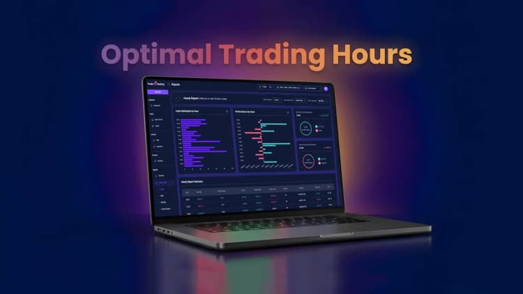
Hourly Report Snapshot
The Hourly Report Snapshot breaks down your results by time of day. This is particularly useful for crypto traders because price action varies significantly between the Asian, European, and U.S. sessions.
You may discover that your best performance comes during U.S. market overlap hours when liquidity deepens and volatility increases. Or you may see the opposite. Perhaps late-night trading leads to emotional mistakes and poor decision-making.
With TradeChainly, this insight is not guesswork. You see the numbers clearly and adjust your trading schedule to match your strengths.
Recent Trades Table
Finally, the dashboard includes a Recent Trades Table showing your latest trades and their results. This acts as a reality check. Even if your long-term metrics look stable, your recent trading behavior may tell a different story.
Maybe you had a disciplined streak followed by a few impulsive trades. Or perhaps your execution quality is improving and your last several trades reflect tighter risk and better structure. The Recent Trades Table keeps you grounded in the present, while the rest of the dashboard shows your long-term trajectory.
Together, these snapshots help you answer key performance questions quickly:
Which symbols should I prioritize?
Which days do I trade best?
Which sessions suit my style?
Is my recent performance aligned with my long-term results?
Instead of guessing, you see the answers right in front of you.
How to Use Dashboard Metrics to Improve Performance
So far, we have focused on what each TradeChainly dashboard metric means and how to read it. But the real value comes from using these insights to actually improve your trading behavior. Data without action is just information. Data with intention becomes a competitive advantage.
Here is how serious crypto traders use the TradeChainly dashboard to tighten their edge and build discipline over time.
Using Metrics to Spot Emotional Trading
One of the biggest benefits of the dashboard is that it exposes emotional decision-making. If your Day Win Percentage is significantly lower than your Trade Win Percentage, it often means you are giving profits back later in the session. That can happen when you continue trading after reaching your daily goal, or when you chase losses after a bad trade.
By reviewing these two metrics side by side, you can set clearer rules for yourself inside TradeChainly. For example, you might decide to stop trading after three consecutive losing trades, or once you hit a certain daily P&L threshold. Over time, your Day Win Percentage should stabilize as discipline improves.
Using Risk-Reward Metrics to Control Downside
The Average Win/Loss Ratio and Profit Factor reveal whether your trading strategy is structurally healthy. If your losers are consistently larger than your winners, or your Profit Factor is stuck below 1.0, it usually means risk is not being controlled effectively.
Crypto leverage magnifies this problem. A single oversized losing trade can wipe out the gains from an entire week of good execution. When you see this pattern in TradeChainly, it becomes clear that the solution is not “more signals” or “better indicators,” but rather better position sizing, tighter stops, and sticking to your planned exits.
Some traders even track how these metrics change after making adjustments. For example, after reducing position size on Bybit or OKX, you might notice that your drawdowns shrink and your Profit Factor becomes more stable. The dashboard gives you instant feedback on whether your changes are actually working.
Using Time-Based Charts to Understand Rhythm and Flow
The cumulative and daily P&L charts help you see whether your progress is smooth or chaotic. If your equity curve looks like a roller coaster, it often means your risk is inconsistent or your emotions are driving trade decisions.
Many traders set a goal to make their cumulative P&L line smoother over time, not just higher. That means fewer oversized bets, fewer revenge trades, and more patience with high-quality setups.
The Trading Days Calendar and time snapshots reveal your most dangerous periods. You may see that you make bad decisions late at night, after long trading sessions, or during specific volatile market conditions. When you recognize these trends, you gain the power to avoid them.
Using Symbol Performance to Trade Where You Have Real Edge
The Symbol Report Snapshot makes it obvious that you perform better on some pairs than others. Maybe you read Bitcoin price action better than altcoins. Maybe SOLUSDT behaves in a way that fits your strategy but low-cap pairs do not.
In that case, the improvement plan is simple. TradeChainly is telling you to specialize.
Over time, narrowing your focus to the pairs where you consistently perform best usually leads to better results, less noise, and deeper pattern recognition.
Using the Dashboard as a Daily Reflection Tool
Many traders develop a simple habit. At the end of each trading day, they open the TradeChainly dashboard and ask themselves a few honest questions:
Did I stick to my plan today?
Did I respect my stops?
Did I size correctly?
Did I force trades out of boredom or FOMO?
When you combine these reflections with real data, it is very hard to lie to yourself. The numbers tell the truth. And truth is what allows growth.
In short, the TradeChainly dashboard is not just a reporting screen. It is a self-coaching tool. It gives you the awareness needed to correct bad habits early, reinforce good behavior, and build consistency in one of the most demanding trading environments in the world.
When to Move Beyond the Dashboard
The dashboard is designed to give you a clear, high-level view of your performance. It answers the big questions first. Are you profitable? Is your risk under control? Are you improving over time? But as your trading evolves, there will be times when you need to go deeper than the overview.
That is when the rest of TradeChainly becomes even more powerful.
If a metric on your dashboard raises a question, you can drill down to find the real cause. For example, if your Profit Factor is weak, you might open the Trades page to study your losing trades more closely. You can filter by exchange, symbol, side, or tag to see which types of trades are dragging down your results.
If your Day Win Percentage is inconsistent, you can review the Daily Journal. This helps you understand what you were thinking, how the market felt, and whether emotions influenced your performance on those days. Patterns often emerge when notes and data are viewed together.
If your symbol or time-based snapshots reveal strong differences across markets or sessions, the Reports section gives you a much deeper breakdown. You can see which pairs, days, hours, or conditions align most strongly with your edge. This is where many traders discover unexpected truths about their habits and strengths.
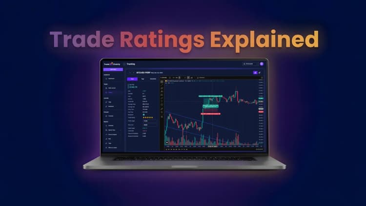
You can also drill into individual trades using the Trade Details page. This is where you review the execution itself, including entry, exit, stop placement, and trade rating. Combined with tags such as setups or mistakes, this creates a full picture of not only what happened but why it happened.
In other words, the dashboard is your compass. It points you in the right direction. The rest of TradeChainly gives you the map so you can navigate toward improvement with precision.
As you grow as a trader, you will find yourself moving back and forth between the dashboard overview and deeper analysis tools. This rhythm is healthy. It means you are no longer guessing about your performance. You are treating your trading like a real business built on data, reflection, and continuous optimization.
Conclusion and Final Thoughts
A lot of traders think improvement comes from finding the perfect indicator, the newest strategy, or the next hot altcoin. In reality, long-term consistency usually comes from understanding your own behavior and performance at a deep level. That is exactly what the TradeChainly dashboard helps you do.
Instead of trading blindly or relying on memory, you get a clear and honest snapshot of your results across every crypto exchange you connect. You see how profitable you really are. You see whether your winners outweigh your losers. You see when you trade well, which symbols suit you best, and whether your risk is truly under control.
Over time, these insights compound. Small improvements in risk management, discipline, and trade selection begin to stack up. Your equity curve becomes smoother. Your drawdowns become smaller. Your mindset becomes calmer because you finally understand the truth behind your performance.
The goal is not perfection. The goal is awareness and steady growth.
If you are going to take crypto day trading seriously, you need a system that tracks your data accurately, updates automatically, and turns raw trades into meaningful insight. TradeChainly was built for exactly that purpose. It gives you the clarity you need to trade with intention instead of emotion.
So the next time you log in, treat your dashboard as more than just a statistics page. Treat it as a daily accountability partner. Check your metrics. Reflect on your performance. Adjust your decisions. Repeat the process.
That is how traders turn experience into progress. And that is how TradeChainly helps you build a more disciplined, data-driven trading career.